Error Report UX
As a UX designer and Digital Strategist at Akademiska Hus I conducted a study to improve the error report flow in a facility management app.
I set up an interview with a couple of operating technicians and facility managers to gain insight of how the error report is used on a daily basis, and where the current solution was lacking.
I then also made a survey to gain insights from users at campus, like university professors, other employees at the universities and facility managers. The survey included questions about the error report, but also other questions about usage of the app and the website that provides the same functionality, to gain insights for further projects.
After analysing the survey and interviews I concluded that the main issues with the current solution was that:
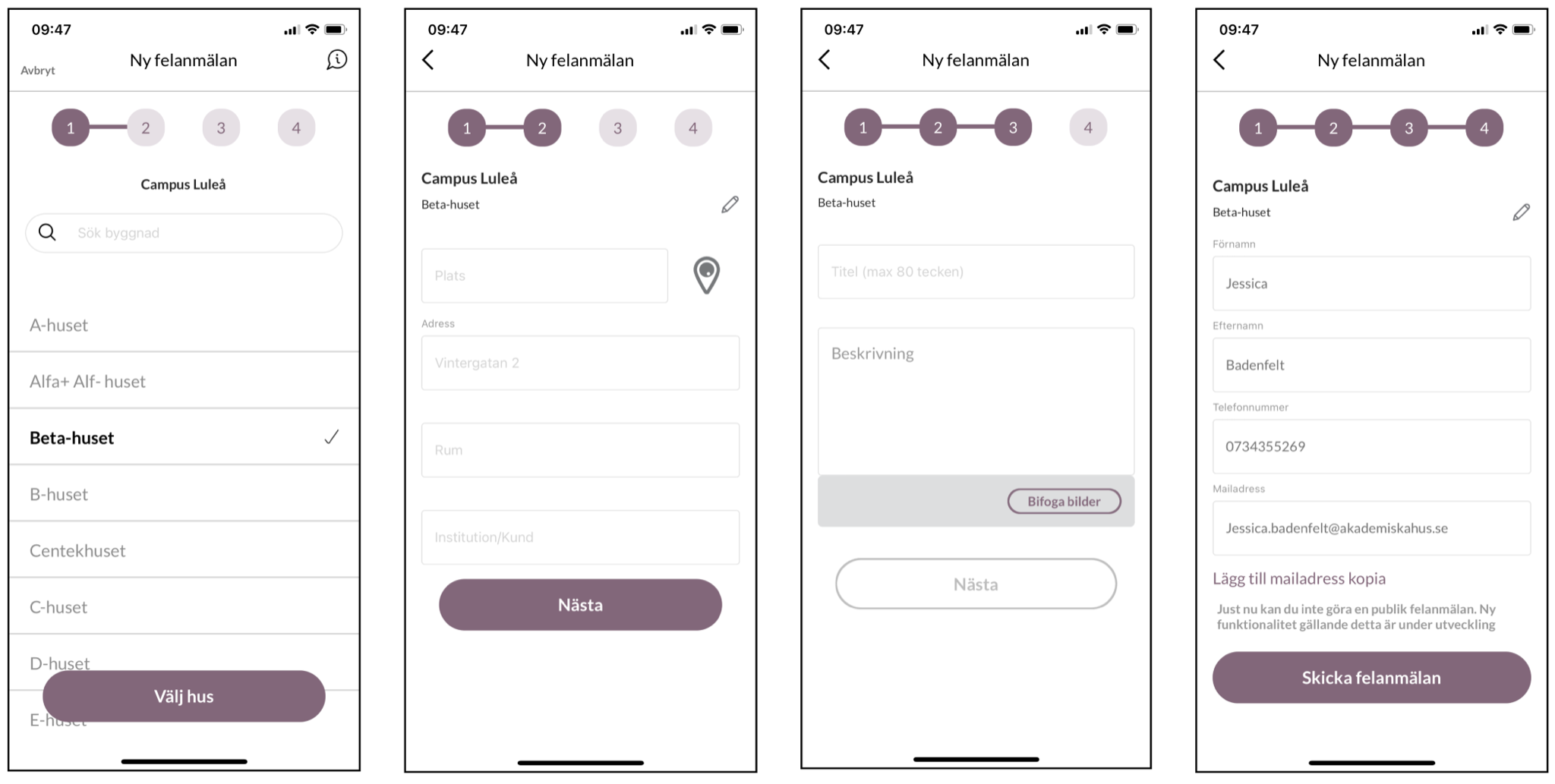
- As a user one can only have one campus selected in the app. Several of the facility managers are responsible for more than one campus and thus needs to go to the settings and change campus every time they cross the road to the other campus.
- There are to many steps of information that you need to fill in, some of which are not always necessary or could be fetched by just selecting the right building.
- There is no clear feedback when you have made an error report. It also takes a while for it to show in the listing, so sometimes it's unclear if it went through.
The New Design
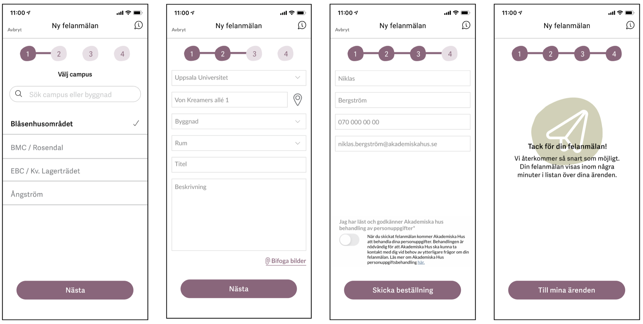
After an iterative design process where I included both facility managers and developers I landed the design shown above.
The new design features
- Several "Favourite" campuses set by the users under settings.
- A shorter form for the user to fill in, there some of the input fields are pre filled, but editable.
- A Thank you-page that works as a confirmation for the user that the error report was received and is being processed.