Menu revamp
As a UX designer at Vagabond Shoemakers I got the task of improve the menu of the website.
The current solution had several shortcomings:
- Editors had little ability to make adjustments to to the menu.
- Several pages had no natural space in the menu.
- The mobile version differed a lot from the desktop version.
- The menu did not meed accessibility criterions.
The lack of accessibility was not critical at the moment, since Vagabond didn't have to meet the accessibility criterions by law at the time, but I believe that good UX should be good for everyone and that includes making the design accessible.
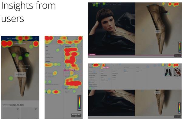
By research, benchmarking, heatmaps and workshops some conclusions were drawn.
- Mobile users navigate deeper in the structure wile desktop users are more interested in the main categories.
- Mobile users don't use the chat to the same extent as desktop users.
- Women are more interested in News and season based categories, while men are more interested in sale and outlet.
- Most of the websites I benchmarked had the logo to the left and the header icons to the right, within thumb reach.
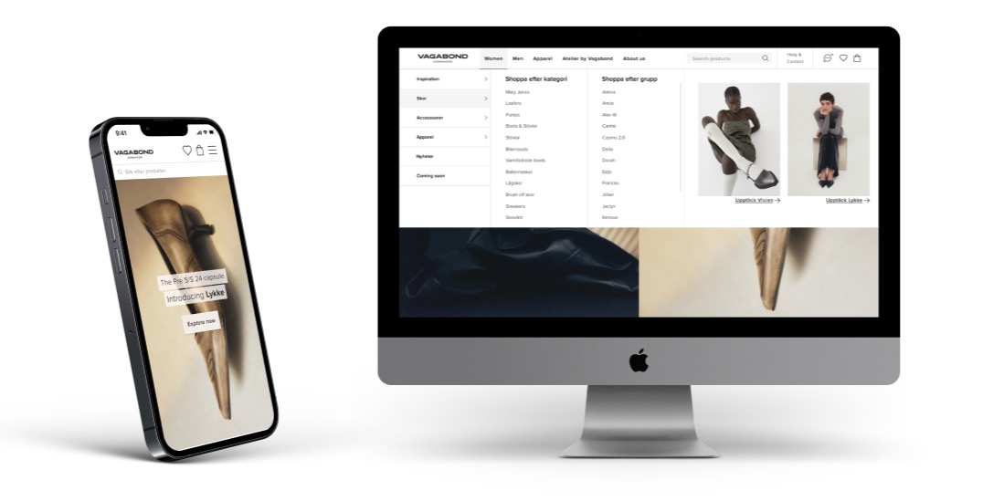
The New Design
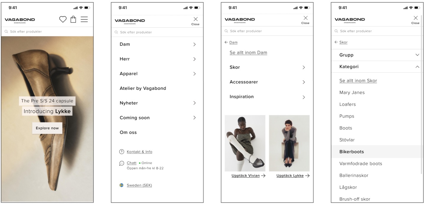
The new design includes:
- Icons that are placed to the right, within thumb reach (for 80 % of users).
- Left-aligned logo. This is more according to the desktop design, and leaves room for icons.
- Search bar that is always available, to encourage user to search for what they are looking for.
- A menu with several levels to navigate down the structure and narrow down the results.
- A clear hierarchy for menu items (i.e. Contact & Info is visually less prominent than shopping categories).
- Promo-block for campaigns and categories that needs to be highlighted.
- A dynamic and scaleable structure to make room for more pages.