Product listing redesign
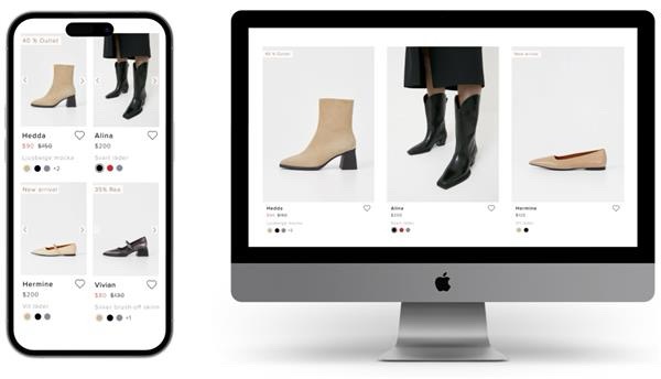
The original task was to make a better design solution for the material picker on listings. Some products have as many as 14 color and material options, which makes the listings look cluttered. Sometimes there is only a difference in material and not color, which is then presented as tree black dots looking like the same option displayed multiple times.
This needed to be fixed, but the more I worked with the product cards, the more I realised that there are several issues with them.
Some of the other issues were:
- The arrows on the image are sometimes not visible when the image is too black.
- The Favoutite icon is sometimes covered in desktop by an icon that lets the users search the image.
- The Favourite icon is also sometimes not visible for the same reason as the arrows.
- The text is centered, which is not great for accessibility.
- The quick shop displays a size selector with very small buttons.
The lack of accessibility was not critical at the moment, since Vagabond didn't have to meet the accessibility criterions by law at the time, but I believe that good UX should be good for everyone and that includes making the design accessible.
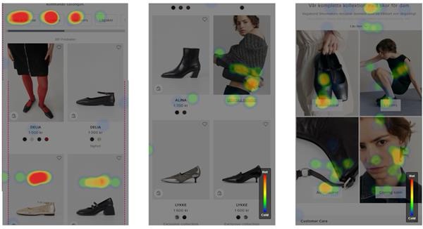
By research, benchmarking, heatmaps and workshops some conclusions were drawn.
- Users look at several product images for the same product.
- Users don't change color of the product on the listing page. On most other websites this is not possible, so this is possibly not something users are used to.
- The quick shop is not used in this step. Users probably need more information to make the decision to buy a product.
- Favourites are not really used either.
- Users navigate to other pages through promo blocks.
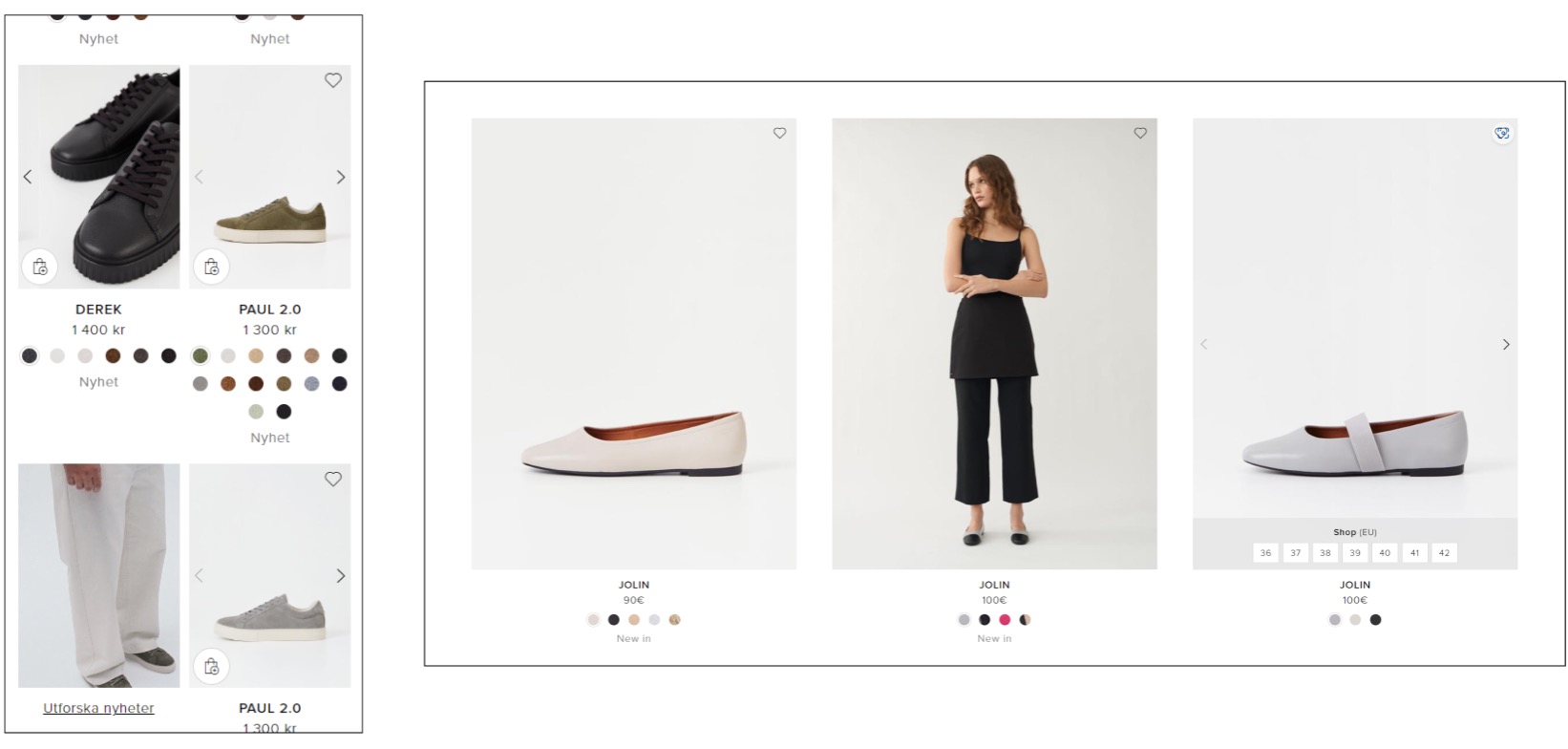
The New Design
The new design includes:
- More prominent tag for sale and news.
- White background behind arrows.
- Color and material name for color picker.
- Number that indicates number of color and material options if there are more than three.
- Favourite icon that is more visible and easier to target on desktop.
- Name of product displayed in lowercase and left aligned for accessibility.